How to Lie with Statistics?
According to Wikipedia “Statistics is a branch of applied mathematics dealing with data collection, organization, analysis, interpretation, and presentation. Statistics helps in the study of many other fields, such as science, medicine, economics, psychology, politics, and marketing. In addition to being the name of a field of study, the word “statistics” also refers to numbers that are used to describe data or relationships.” The title of this post is quoted from a very famous book from the 1950s. It’s a very interesting read.
Before we can describe the world with statistics and how it can be manipulated, we must collect data. After we collect data, we use one or more numbers to describe each observation or measurement. For example, suppose we want to find out how popular a certain TV show is. We can pick a group of people (called a sample) out of the total population of viewers. Then we ask each viewer in the sample how often they watch the show. For another example, if we want to know whether a certain drug can help lower blood pressure, we could give the drug to people for some time and measure their blood pressure before and after.
But, if you observe carefully, you can see the biases, loopholes, and chance of manipulation of the result due to a lack of relevant data samples. A person can also manipulate the final data in order to represent the data that conform to his/her biases. The choice of which individuals to take for a survey or data collection is important, as it directly influences the statistics. Not to mention, we need an unbiased panel of individuals to analyze and publish the data.
Suppose we want to measure the water quality of a big lake. If we take samples next to the waste drain, we will get different results than if the samples are taken in a far away, hard to reach, a spot of the lake. We can reduce chance errors by taking a larger sample, and we can avoid some bias by choosing randomly. However, sometimes large random samples are hard to take. And bias can happen if different people are not asked, or refuse to answer our questions, or if they know they are getting fake treatment. These problems can be hard to fix. That’s how homeopathy convinces people that they are being treated with a sugar ball dipped in alcohol.
Correlation does not imply causation. In this post, I will outline errors when it comes to the interpretation of statistics, and how these errors may create incorrect conclusions. It also shows how statistical graphs can be used to distort reality, for example by truncating the bottom of a line or bar chart, so that differences seem larger than they are, or by representing one-dimensional quantities on a pictogram by two- or three-dimensional objects to compare their sizes so that the reader forgets that the images do not scale the same way the quantities do.
- Where People Can’t Live Without The Internet! One of the most damaging sources of misleading statistics is sampling bias. Here is one research done by Forbes with Statista to gauge public attitudes towards technology and internet addiction.
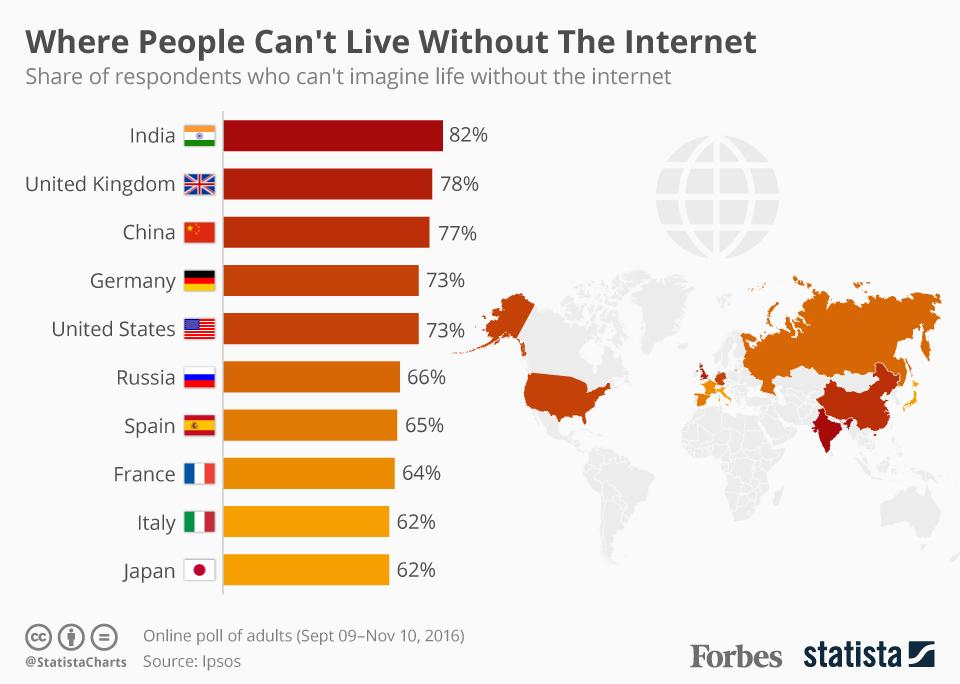
So, Where does the sampling bias comes into play here? If you look at the infographic above, you can see that people who will bother enough to register for an ONLINE survey on the topic “Life without Internet”, you can easily deduce the sampling bias here where the percentage will obviously go up for polls conducted online vs conducted via random channels, both online and offline.
- More than 80% of Dentists recommend Colgate. There are many examples of companies and organizations using misleading statistics obtained through inaccurate statistical methods. We have heard of advertisements it is claimed that the particular product is recommended by 80% of experts as compared to other competing brands.
This is achieved through purposeful and selective bias and also by representing proportions of a biased sample as percentages of the population. Suppose in a particular sample of 20 experts 19 experts recommend a product then it is claimed that 95% of experts recommend the product.
In 2007, Colgate was ordered by the Advertising Standards Authority (ASA) of the U.K. to abandon their claim: “More than 80% of Dentists recommend Colgate.” The claim, which was based on surveys of dentists and hygienists carried out by the manufacturer, was found to be misrepresentative as it allowed the participants to select one or more toothpaste brands. Fortunately, The ASA continued, “Because we understood that another competitor’s brand was recommended almost as much as the Colgate brand by the dentists surveyed, we concluded that the claim misleadingly implied 80 percent of dentists recommend Colgate toothpaste in preference to all other brands.”
-
Sex Bias in Graduate Admissions One of the best-known examples of Simpson’s paradox (in which a trend appears in several different groups of data but disappears or reverses when these groups are combined.) is a study of gender bias among graduate school admissions to University of California, Berkeley. The admission figures for the fall of 1973 showed that men applying were more likely than women to be admitted, and the difference was so large that it was unlikely to be due to chance.
<img width="369" height="103" src="https://lh6.googleusercontent.com/KRNyDAqScKgDJC0vERUX1ypLd7tt2H8QTDr3gOFZCE5cnWdgMIwVfHNHtisXCs7D8m6gk-FjsR1BZTJ55w9zjrUUOXMKG2tOaWDN1e4gNt4u9f_hUU-hd-IyuTftfc0zOsy_iToB">
However, when examining the individual departments, it appeared that six out of 85 departments were significantly biased against men, whereas four were significantly biased against women.
The research paper by Bickel et al. concluded that women tended to apply to competitive departments with low rates of admission even among qualified applicants (such as in the English Department), whereas men tended to apply to less-competitive departments with high rates of admission among the qualified applicants (such as in engineering and chemistry).
- Statistics skewed by incorrect visual representation Visual representation is one of the best methods to show a statistic. It’s simplicity provide a better ways to understand a trend. It is helpful for not only a professional but also to a layman. But the same representation is one of the most deceitful methods if someone is trying to prove a point. Consider below images from Fox news and other sources:
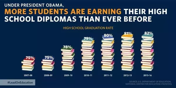
A. In mid-December, the White House tweeted: “Good news: America’s high school graduation rate has increased to an all-time high.🎓”, Chart is shown below. This has several problems. First, it’s never a good idea to illustrate elements of a chart. What does it even mean that five books is equal to 75%, or that 16 books is equal to 82%? But ultimately, this is a column chart, and column charts must always start the y-axis at zero.
**B. Below is a pictograph of the average female height per country. Now, observe what’s wrong with this graphic. A classic example of a **skewed visual representation of statistics.
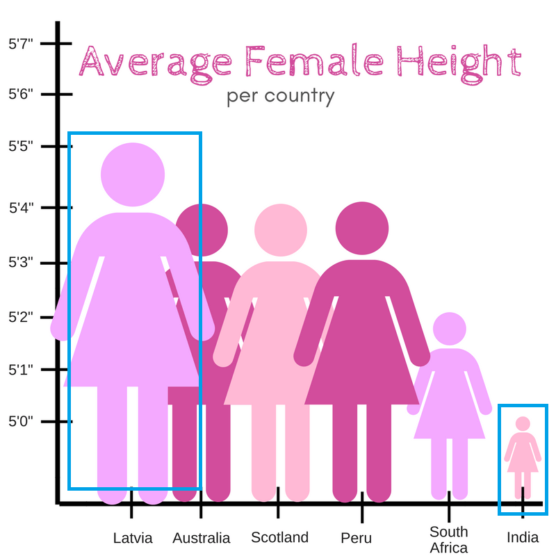
The graph, all painted in pink, showing symbols of ladies laid out according to their height in inches. But the proportions were so off that Indian women looked like tiny smurfs compared to Latvian giants. Actual difference - 0.5 feet. Visual Difference - 10 feet.
A good pictograph needs to be arranged carefully and in a logical manner, which this example is clearly lacking. Although the actual author of this pictograph is not known, it’s fair to say that what they tried to convey didn’t quite work out.
C. This is my favorite. How political agenda can skew the overall narrative! As petrol and diesel prices in India soared to record highs of ₹ 80.73 and ₹ 72.83 in Delhi on 10 September, 2018, and Opposition parties observed a nationwide shutdown, the ruling Bharatiya Janata Party (BJP) tweeted graphics that suggested that fuel prices had steadily increased from 16 May, 2004, just before the opposition Congress had formed a coalition government, until 16 May, 2014, just before the current BJP-led government was formed, and had then fallen until 10 September, 2018.
In fact, the graph incorrectly depicted bars not made to scale, with the bar for fuel prices on 10 September, 2018 (petrol at ₹ 80.73 and diesel at ₹ 72.83) shorter than the bar for 16 May, 2014 (when petrol was priced lower at ₹ 71.41 and diesel at ₹ 56.71).
Below is the incorrect graph posted by the party:
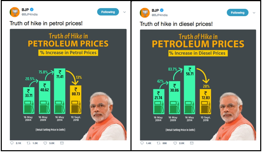
A correct graph would have shown bars built to scale, so that the bar for 10 September 2018, would be bigger. The graphics were widely criticized in the media and particularly lampooned on social media.
There are many such examples of visual representations of statistics, which is incredibly important for regular people to comprehend data behind statistics, and a major way to reach the masses. So, if skewed, it creates bias among the general populace.
In conclusion, statistics and data are everywhere around us. But, so does bias in it. It’s important for us as rational humans to ascertain the difference when we are shown such statistics so as to not cloud our judgement both in the short and long term. But, we can’t expect everyone to research biases (If you want to, then I’ve created a detailed post on biases here).
Here are some simple yet effective ideas based on research to avoid the hidden traps and biases around you:
- Ask questions. Question assumptions.
- Always view a problem from different perspectives. Try using alternative starting points and approaches rather than sticking with the first line of thought that occurs to you.
- Create opposing and supporting hypotheses for the assumptions. Observe if it matches with the reality. Don’t let your pre-existing belief cloud your judgement.
- Think about the problem on your own before consulting others to avoid becoming anchored by their ideas. But,
- Be open-minded. Seek information and opinions from a variety of people to widen your frame of reference and to push your mind in fresh directions.
- Never think of the status quo as your only alternative. Identify other options and use them as counterbalances, carefully evaluating all the pros and cons.
- Examine why admitting to an earlier mistake distresses you. If the problem lies in your own wounded self-esteem, deal with it head-on.
- Get someone you respect to play devil’s advocate, to argue against the decision you’re contemplating.
- To reduce the effects of overconfidence in making estimates, always start by considering the extremes, the low and high ends of the possible range of values.
- Be honest with yourself about your motives. Even if you can’t eradicate the distortions ingrained into the way your mind works, you can build tests and disciplines into your decision-making process that can uncover errors in thinking before they become errors in judgment. Only then you can be successful in getting some sense of the randomness around you.